Disclaimer: This example is taken from a reference titled ‘R In A Nutshell’ by Joseph A. Adler
Classification is another type of supervised learning in Machine Learning (ML). Classification is a process of categorizing a given set of data into classes. The classes are also known as target, label or categories (thus categorization).
Examples of classification problem includes predicting weather a particular patient is diabetic or not based on their collected medical data/records, or to scan if incoming email is spam or not based on a list of filtered keywords.
Today, we are going to look at an example of a classification problem taken from the reference book. In this example, we will apply a logistic regression model.
Logistic regression is a statistical model that in its basic form uses a logistic function to model a binary dependent variable, although many more complex extensions exists. In regression analysis, logistic regression is estimating the parameters of a logistic model (a form of binary regression). Mathematically, a binary logistic model has a dependent variable with two possible values, such as pass/fail which is represented by an indicator label, where the two values are labeled “0” and “1”.
– Wikipedia
The sample dataset that we will use is a field goal dataset. Each time a kicker attempts a field goal (i.e.. kick), there is a chance that the goal will be successful, and a chance that it will fail. The probability varies according to distance; any attempts closer to the goal posts are more likely to be successful.
As usual before we start, load the lattice package.
library(lattice)Next, load the dataset.
load("field.goals.rda")Check the dimension of the dataset.
> dim(field.goals)
[1] 982  10
Call head() on the dataset to get an idea how the data looks like.
> head(field.goals)
  home.team week qtr away.team offense defense  play.type        player yards stadium.type
1       ARI   14   3       WAS     ARI     WAS    FG good   1-N.Rackers    20          Out
2       ARI    2   4       STL     ARI     STL    FG good   1-N.Rackers    35          Out
3       ARI    7   3       TEN     ARI     TEN    FG good   1-N.Rackers    24          Out
4       ARI   12   2       JAC     JAC     ARI    FG good   10-J.Scobee    30          Out
5       ARI    2   3       STL     ARI     STL    FG good   1-N.Rackers    48          Out
6       ARI    7   4       TEN     TEN     ARI FG aborted 15-C.Hentrich    33          Out
Let’s transform the dataset and create a new binary variable for field goals that are either good or bad.
field.goals.forlr <- transform(field.goals, good=as.factor(ifelse(play.type=="FG good","good","bad")))View the transformed dataset. A new column “good” has been added to the dataset.
> head(field.goals.forlr)
  home.team week qtr away.team offense defense  play.type        player yards stadium.type good
1       ARI   14   3       WAS     ARI     WAS    FG good   1-N.Rackers    20          Out good
2       ARI    2   4       STL     ARI     STL    FG good   1-N.Rackers    35          Out good
3       ARI    7   3       TEN     ARI     TEN    FG good   1-N.Rackers    24          Out good
4       ARI   12   2       JAC     JAC     ARI    FG good   10-J.Scobee    30          Out good
5       ARI    2   3       STL     ARI     STL    FG good   1-N.Rackers    48          Out good
6       ARI    7   4       TEN     TEN     ARI FG aborted 15-C.Hentrich    33          Out  bad
We are going to plot the dataset to have a better understanding on the relationship between field goals and distance (column: yards). Before that, let’s tabulate the dataset.
> field.goals.table <- table(field.goals.forlr$good, field.goals.forlr$yards)
> field.goals.table

       18 19 20 21 22 23 24 25 26 27 28 29 30 31 32 33 34 35 36 37 38 39 40 41 42 43 44 45 46 47 48 49 50 51 52 53 54 55 56 57 58 59 60 61 62
  bad   0  0  1  1  1  1  0  0  0  3  5  5  2  6  7  5  3  0  4  3 11  6  7  5  6 11  5  9 12 11 10  9  5  8 11 10  3  1  2  1  1  1  1  1  1
  good  1 12 24 28 24 29 30 18 27 22 26 32 22 21 30 31 21 25 20 23 29 35 27 32 21 15 24 16 15 26 18 14 11  9 12 10  2  1  3  0  1  0  0  0  0
The top row is the yards. Followed by the total bad and good field goals respectively.
Now, we plot the results.
plot(colnames(field.goals.table), field.goals.table["good",]/ (field.goals.table["bad",] +field.goals.table["good",]), xlab="Distance (Yards)", ylab="Percent Good")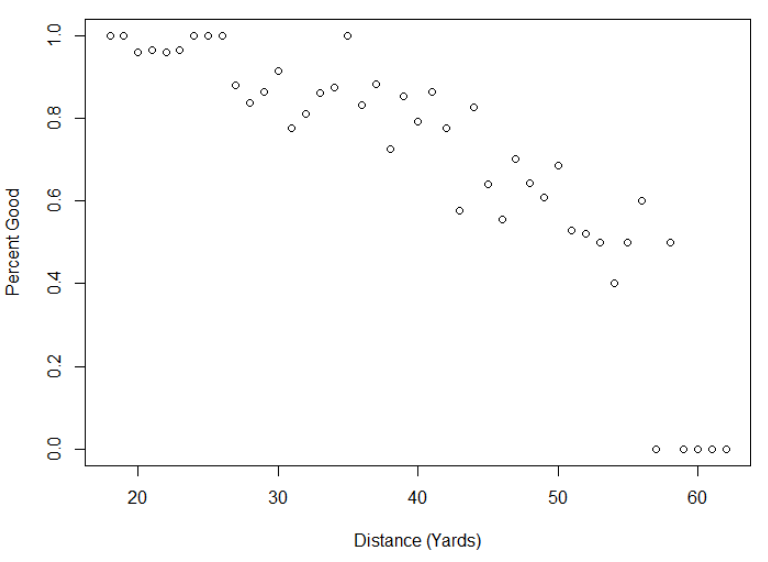
We can see from the plot that there is a linear relationship between the field goals and the distance, though with some outliers at the right bottom. It clearly shows that as the distance increases, the number of successful field goals decreases. In other words, the closer the player to the goal posts, the higher the chances of scoring a goal.
To model the probability of a successful field goal using a logistic regression, call glm() function.
> field.goals.mdl <- glm(formula=good~yards, data=field.goals.forlr, family="binomial")
> field.goals.mdl

Call:  glm(formula = good ~ yards, family = "binomial", data = field.goals.forlr)

Coefficients:
(Intercept)        yards
    5.17886     -0.09726

Degrees of Freedom: 981 Total (i.e. Null);  980 Residual
Null Deviance:	    978.9
Residual Deviance: 861.2 	AIC: 865.2
The call the summary function to get a more detailed results. We can see the the coefficients for yards is a negative value, which kind of concurred to our earlier hyphotheses i.e. the closer the player to the goal posts, the higher the chances of having a successful field goal.
> summary(field.goals.mdl)

Call:
glm(formula = good ~ yards, family = "binomial", data = field.goals.forlr)

Deviance Residuals:
    Min       1Q   Median       3Q      Max
-2.5582   0.2916   0.4664   0.6978   1.3789

Coefficients:
             Estimate Std. Error z value Pr(>|z|)
(Intercept)  5.178856   0.416201  12.443   <2e-16 ***
yards       -0.097261   0.009892  -9.832   <2e-16 ***
---
Signif. codes:  0 ‘***’ 0.001 ‘**’ 0.01 ‘*’ 0.05 ‘.’ 0.1 ‘ ’ 1

(Dispersion parameter for binomial family taken to be 1)

    Null deviance: 978.90  on 981  degrees of freedom
Residual deviance: 861.22  on 980  degrees of freedom
AIC: 865.22

Number of Fisher Scoring iterations: 5
Finally, plot the results to see how this model fits the data, and we are also going to draw a line to show the trends.
> plot(colnames(field.goals.table), field.goals.table["good",]/ (field.goals.table["bad",] + field.goals.table["good",]), xlab="Distance (Yards)", ylab="Percent Good")
> # add a line to chart
> fg.prob <- function(y) {
+     eta <- 5.178856 + -0.097261 * y;
+     1 / (1 + exp(-eta))
+ }
> lines(15:65,fg.prob(15:65),new=TRUE)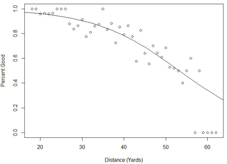
As expected from the statistics above, the model looks like it fits the data reasonably well.
Click here to download the dataset.