Lisa is a 10-year-old girl who setup a small stall selling lemonade in front of her house. She has been keeping tab of her sales for the past 1 year (in 2017). She wanted to know how much she’s making and how much she can make for the next year, if she is to keep her lemonade business.
As her neighbor who also happen to be a data analyst, your tasks would be to help Lisa analyze her lemonade sales data and find out;
- how much is the lowest and highest sales (lowest = 7, highest = 43)
- what are the factors that affecting her sales, for both lowest and highest.
- what is the correlation (relationship) between the factor(s) and her sales.
To begin with, you can download the lemonade data below.
Let’s start!
First, of course we need to add the import statements.
import pandas as pd
import numpy as np
import matplotlib.pyplot as plt
import seaborn as sns
Next step is to load the dataset. Once loaded, we can check the dimension of the dataset. Since Lisa been recording her sales for the whole year, then it should contain 365 records.
# load the data
data = pd.read_excel('data/Lemonade.xlsx')

# get the dimension/shape of dataframe
print(data.shape)
To view the first 5 rows of records, call pandas’s head() function. The syntax for the head function is head(n) where n is the number of rows you want to view.
# view the first 5 rows
data.head()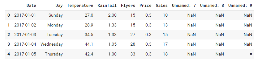
To view the last 5 rows of records, call the tail() function. The syntax for the tail function is tail(n) where n is the number of records you want to view.
# view the last 5 rows
data.tail()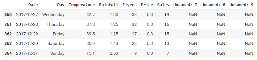
From the records, you can see that the dataframe contains 10 columns, but the last 3 was Unnamed and does not contain any useful information. So what we are going to do next is to drop these 3 columns from the dataframe.
# get the column names
cols = data.columns
print(cols)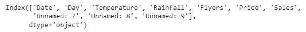
# drop those unnamed columns
data = data.drop(columns=['Unnamed: 7', 'Unnamed: 8', 'Unnamed: 9'])
print(data)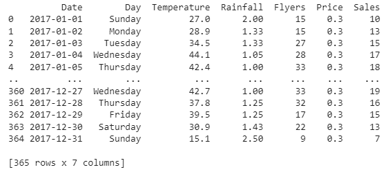
As for now, we’ve done with preparing the dataframe for analysis.
pandas’s dataframe contains lots of built-in functions that can be called on, such as describe() where it will generate the summary statistics.
# get the summary statistics
data.describe()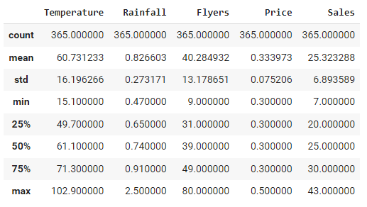
From the summary statistics we can see that the lowest sales is 7 and the highest sales is 43. We can also see that the min and max temperatures are 15.1 and 102.9 respectively, whereas for rainfall, the minimum and maximum are 0.47 and 2.5 respectively. We are going to use this information later.
Now that we know the lowest and highest sales of the year, we need to find out now when is the date and day when the sales are lowest and highest. For this, we are going to do filtering.
# find out when is the lowest sales
data[data.Sales == data.Sales.min()]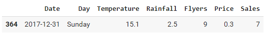
# find out when is the highest sales
data[data['Sales'] == data['Sales'].max()]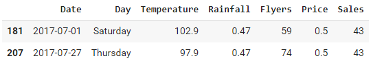
The lowest sales happened on a Sunday, 31st December 2017 whereas the highest sales occurred on 1st and 27th July 2017.
Next question is, what is the reason behind this? Why the sales is lowest in December and highest in July? Apparently, Lisa is living in a 4 seasons country, where December is when the winter is and July is summer. This piece of information is going to help us with our next analysis – that is to find out the factors that affecting the sales.
Let’s look at the Temperature and Rainfall columns for both lowest and highest sales. For lowest sales, the temperature records was 15.1 and rainfall was recorded as 2.5. Both are the minimum temperatures and maximum rainfall.
How about the highest sales? It was recorded as high as 102.9 for temperatures with 0.47 for rainfall. Again, those the the maximum temperatures and minimum rainfall.
It can now be safely concluded that the temperatures and rainfall are the factors that affecting the sales. But of course we need to proof it with some numbers. That’s why we are going to find the correlations between temperature and sales, and also between rainfall and sales.
# find correlation between Temperature and Sales
cor = data['Temperature'].corr(data['Sales'])
print("Correlation between Temperature and Sale is {}".format(cor))
You can see that the correlation between temperature and sales is a highly positive, or directly proportional, which translated as, as temperature increases, the sales would also increases.
Let’s try to plot it.
# plot the data to see the correlations
plt.title("Sales vs Temperature")
plt.xlabel('Temperature')
plt.ylabel('Sales')
plt.grid()
plt.scatter(data['Temperature'], data['Sales'])
plt.show()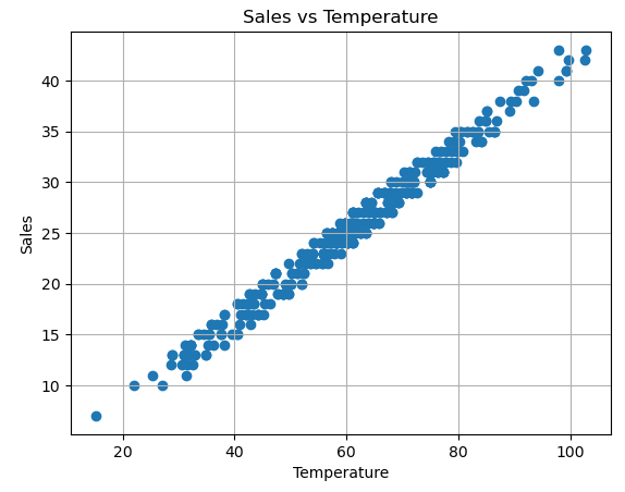
Next, let’s try to find the correlation between rainfall and sales.
# find correlation between Rainfall and Sales
cor = data['Rainfall'].corr(data['Sales'])
print("Correlation between Rainfall and Sale is {}".format(cor))
Rainfall and sales has a highly negative correlation, or inversely proportional. Which means that, as rainfall increases, the sales will decreases.
# plot the data to see the correlations
plt.title("Sales vs Rainfall")
plt.xlabel('Rainfall')
plt.ylabel('Sales')
plt.grid()
plt.scatter(data['Rainfall'], data['Sales'])
plt.show()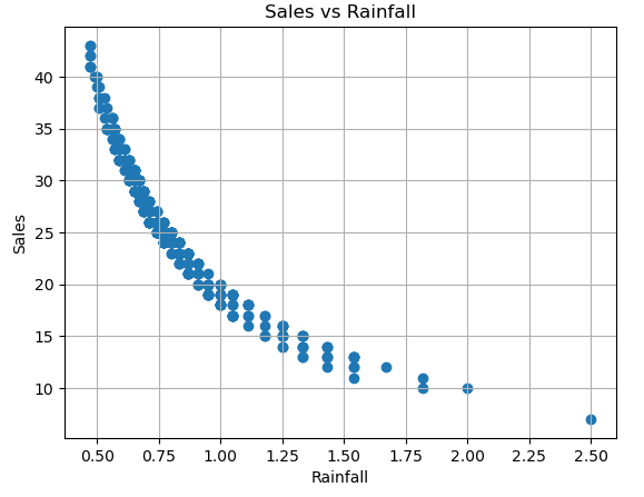
We can continue to analyze other features that might be affecting the sales, like flyers and price.
# find correlation between Flyers and Sales
cor = data['Flyers'].corr(data['Sales'])
print("Correlation between Flyers and Sale is {}".format(cor))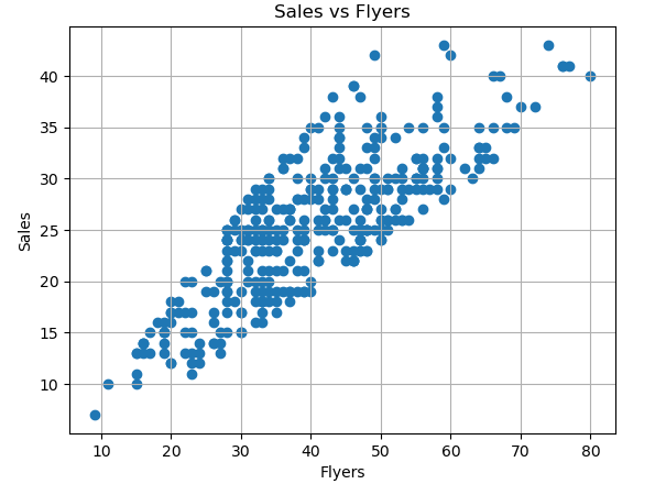
Although flyers and sales do have a positive correlation, it is not as strong as the correlation between temperature and sales.
Alternatively, we can use seaborn module to plot the data.
# use seaborn combo to plot data
sns.jointplot(x = 'Temperature', y = 'Sales', data = data, kind = 'reg', color = 'm', height = 7)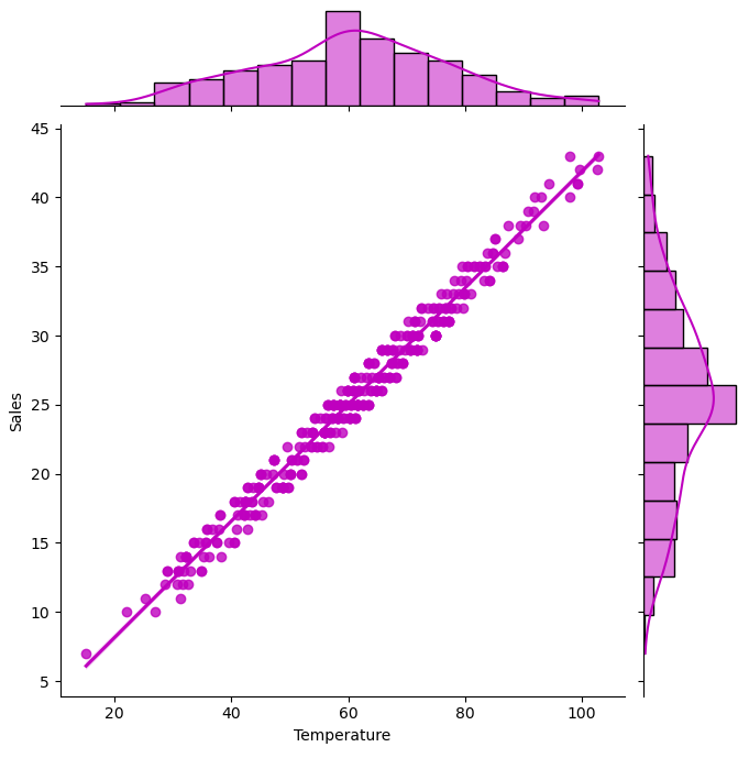
We can use boxplot (box and whiskers) to visualize the min, max, mean and see if there are outliers.
# see if there's outlier(s)
sns.boxplot(x = data['Sales'])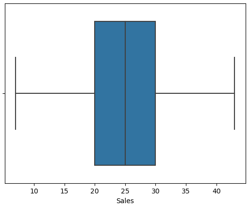
Finally, we can use histogram to visualize the distribution of the data.
# plot the data
sns.displot(data = data, x="Sales")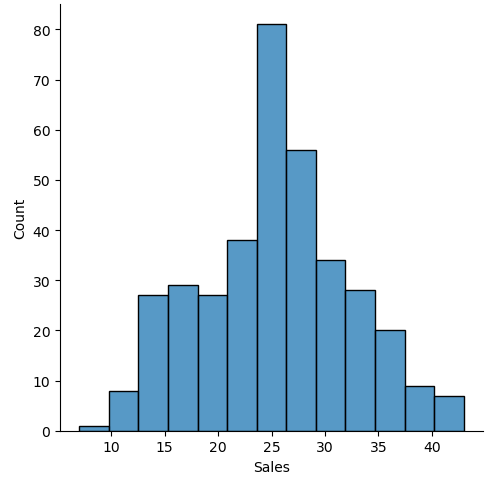
The end.